Monday 23 June 2008

we did it all for the don


this is lyrics taken from an Against Me! song called "We Did It All For The Don".
its not finished cos i messed up a bit with kerning and the weight of the letters but i guess that makes it a bit unusual. im quite happy with my grid idea though. making the baselines wavey and tops of letters touching bottoms creates a normal reading style which could need a lot of concentration haha.
unfortunately i messed a bit of the "friends". it should be similar weight to the "why" on the left hand side.

Saturday 21 June 2008

Abraxas Promotions


the next gig was my first attempt. i tried to use brash colours for the type of music - new wave indie sort of stuff - and figured i should go mad. i found it hard to be very creative with it to start with but it does what it needs to do.

For the 2nd gig i went at it with a pencil and berol black felt tip because it was a "rock and fucking roll" gig. I got the travisty idea from their myspace page, just went with it. im sure you can tell i like typewriter fonts so i quite like it, but the pen didnt really give a good finish. the no signal input just sort of works with what i heard, i quite like how . Im well chuffed with my microphone as well. its based on the abraxas logo. the original was produced on photoshop and is much more "graphics". The promotion name typewriter font went a bit tits up tho. looks like one of them shit fonts you get and never ever use.

For the last poster i wanted to build on the amount of illustration after reading an article in last hours (blog to follow at some point!) and went for a toaster cos i can make them look pretty nifty in my opinion. then i set it on fire for the same reason that i chose to put it there in the first place. The bands were much more pop punky than the others so i went off on a graffiti style bubble writing thing. the grid is made up of 5 horizontal strips of the same size and i think its pretty obvious in the final outcome.

Saturday 14 June 2008

Texas is the reason poster


this is cool. it has tape on it. and illustration. and it is cool.

Friday 6 June 2008

more gig posters (sorry fred)


i really like the layout of the first poster. the imperfect half/half grid gives it that scrappy feel that appeals to the punk inside me. also, the typography is quite interesting. its legible, but looks as if it doest want to be haha. its successfully put together with the headline band at the top in the largest leading, alng with the date and the price. the times are also well arranged and fit in well with the grid.

in the second poster, the typograph annoys me. why blur it? WHY??
the illustration is pretty cool though, and gives the viewer a reason to have a good long look at the poster. all the anarchists on top of the build with the authorities climbing up castle-invasion style. its good touch to have the skinhead falling off as they generally have predjudice views.

the layout has a collage sort of feel because of the unaligned baselines, but this is a very typical punk design feature (as are the randomly shaped boxes around the band names).

im not sure about the 3rd poster. the colour choices are weird and the image doesnt feel right in the format that the poster is in. i do quite like the composition of the text encircling the illustration, but once again, the illustration is dodgy as fuck.

the brashness of the poster is kind of explained with the oriental text. not wanting to makegeneralisations here, but this brashness comes hand in hand with the visual language of "cool and japanese".

the fourth poster is amazing. totally based on collectivism, it must be for a selection of leftwing bands. i like the combination of photography and illustration, and how well the images work in the grid with the typography. i like that i can tell that the font chosen is eurocentric because of my calendar project.

what is graphic design?


before starting my course in leeds, i thought that graphic designwas more of a specific field of expertise - but at the same time just generally being almost unenecessarily decorative. i was awre of typography, packaging, advertising, book binding and so on, but the actual term "graphic design" brought up very specific visuals when i thought of it.

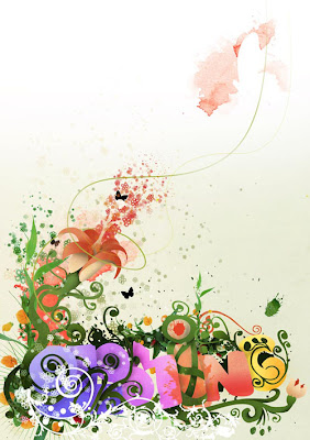
these visuals were generally photoshopped or produced on illustrator (for example, like the second image down in this post), and so needed knowledge of such programs in order to be successful pieces of graphic design. i always found such images quite appealling but never saw myself as a designer as my work was not in this style at all. i guess before starting my degree course, i thought of myself as more of an artist (for want of a better term) because i tended to hand render things or simply mess around with layering in photoshop to make "trippy" imagery.

since being at uni, i've realised that graphics are everywhere - roadsigns, logos, branding, newspaper article layouts and on and on.

Everybody uses graphics, whether they are aware of it or not. some people just use it more successfully and more appropriately. when you're writing a letter, where you choose to write the address on the envelope is graphics. when you write an angry note to flatmates and choose a red pen, thats graphics too.

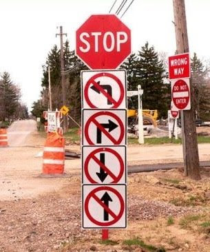
roadsigns are one of the most interesting examples for me. this is because of the semiotics involved - there must not any frills because people are driving past at speed. this means that the imagery must be as basic as possible, but still obvious to what it is. generally, this means a restricted colour palette so as not to confuse the eye. however, colour is a very important part of graphics. i know that james laurie for example, isnt confident enough to use colour at all! the best exampleo colour in semiotic roadsigns are the examples where you arent allowed to do things. every single time this inludes a big red cross through a black symbol on white background. red is the first colour the eye sees and related is to warning and danger. this makes it a very appropriate colour choice.

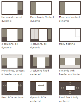
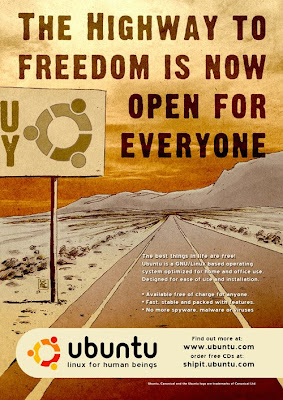
layout and composition is another great interest of mine in the field of graphic design. its something most people (previously including myself) take for granted and do without thinking. all posters, articles, reference books, packaging designs, photography and so on, contain layout grids and are designed with composition in mind.

i think that i have found my calling with these grids. its a good way of combining my writing skills with my newly developed designing skills, and this brings both my fortes together, making them even stronger.

its really interesting to see how typography and image can work together to make really successful graphic design from a compositional point of view. it also means that different layouts can be developed, compared and analysed in order to decide which is the most successful layout.

its also interesting to see when the layout hasnt been considered but the piece is still out there in the wide world. this just makes me want to slap people until they let me rearrange things for them.

i think it'd be really succssful for me to draw up a bunch of layouts for a typographer and illustrator to mess around with. maybe more group work will come of this morbid facination.

in essence. graphic design is everything, because EVERYTHING has to be designed (but unfortunately, not always successfully).